The core problem with modern car touchscreens isn’t the technology itself, but its failure to respect basic principles of human cognition, dangerously increasing your mental workload while driving.
- Physical buttons leverage muscle memory and provide haptic feedback, allowing operation without taking your eyes off the road.
- Touchscreens demand focused visual attention for even simple tasks, creating « cognitive tunnelling » that makes you blind to hazards.
Recommendation: Stop fighting the screen. Instead, adopt a deliberate strategy to manage its cognitive load by pre-configuring settings and mastering a few key functions while stationary.
The familiar frustration is almost universal for modern UK drivers. You get into your new or nearly new car, and a sleek, glossy screen greets you. It looks futuristic, but the moment you need to adjust the heating on a cold morning or change the radio station on the M25, the struggle begins. A task that once took a single, no-look twist of a dial now involves navigating menus, missing touch targets, and taking your eyes off the road for what feels like an eternity. This isn’t just a feeling; it’s a measurable degradation in safety and usability.
Many critiques correctly point out that physical buttons are superior for muscle memory, or that voice commands are a potential, if flawed, solution. But these observations only scratch the surface. The real issue lies deeper, in the clash between the design philosophy of consumer electronics and the high-stakes environment of driving. Your smartphone is designed to absorb your attention; your car’s controls should be designed to demand as little of it as possible. When carmakers copy smartphone interface logic without adapting it to the principles of driving, they create a system that is fundamentally at odds with safety.
But what if the solution wasn’t just to demand the return of buttons, but to develop a new mindset for interacting with these systems? The key to reducing distraction is not to reject the technology, but to understand its cognitive cost and manage it proactively. This isn’t about learning every feature; it’s about mastering a few essential ones to reclaim your focus. It requires treating your car’s infotainment system less like an intuitive appliance and more like a complex piece of machinery that demands a clear, deliberate operating procedure.
This guide will deconstruct the specific usability failures of modern in-car systems. We’ll explore the cognitive science behind why they feel so distracting and provide a strategic framework for you, the driver, to take back control. From connectivity issues to configuring your displays for minimal distraction, we will equip you with the knowledge to make your high-tech car safer and less frustrating to live with.
Contents: Why Your Car’s Touchscreen Fails the Driving Test
- Why Do Touchscreen Climate Adjustments Take 3x Longer Than Physical Dials?
- How to Connect Your Phone to CarPlay Without the Bluetooth Dropout Issues?
- Built-In Sat Nav or Google Maps: Which Provides Better UK Traffic Avoidance?
- The Over-the-Air Update That Bricked 5,000 UK Vehicles’ Screens Last Year
- When to Learn Your New Car’s Touchscreen: The 30-Minute Parking Session That Prevents Accidents?
- How to Configure Your Digital Cluster to Show Only the Information You Actually Need?
- The Repeated Lane Warning That Signals You Need to Stop for a Coffee Break
- Why Do Digital Dashboards Show More Information but Leave Drivers Feeling Less Informed?
Why Do Touchscreen Climate Adjustments Take 3x Longer Than Physical Dials?
The single greatest failure of touchscreen-only controls is the destruction of haptic feedback and muscle memory. A physical dial or button provides a tangible, predictable target. Your hand learns its location, and the click or detent of the control confirms the action without you needing to look. This interaction is processed by your brain with minimal conscious thought, freeing up vital cognitive resources to focus on the road. A flat glass screen offers none of this. Every interaction demands visual confirmation, turning a simple adjustment into a multi-step, high-load task: look, find the menu, touch the target, verify the change, and then re-focus on the road.
This isn’t just an annoyance; it’s a cognitive bottleneck. Human-machine interface research shows that interface delays exceeding 0.5 seconds can cause significant cognitive overload, forcing the brain to switch contexts from driving to « operating a computer. » A Swedish automotive magazine, Vi Bilägare, tested this in 2022, finding that a driver in a modern car with a touchscreen took 10 seconds to perform a series of tasks that took only 4.6 seconds in a 20-year-old car with physical buttons. At 60 mph, that’s over 150 metres driven with divided attention.
The problem is exacerbated by poor interface design. Carmakers often bury essential functions like heated seats or windscreen demisters two or three levels deep in a menu. This design choice, often made for aesthetic minimalism, directly trades driver safety for a clean-looking dashboard. It ignores a fundamental usability principle: the frequency of a function’s use should determine its ease of access. For a driver, nothing is more frequently used—and more critical in a sudden downpour—than climate and defrost controls.
How to Connect Your Phone to CarPlay Without the Bluetooth Dropout Issues?
Wireless Apple CarPlay and Android Auto promise seamless connectivity, but many drivers experience frustratingly frequent dropouts. The root cause is often environmental interference, not a fault with your car or phone. As the experts at ATOTO explain, these systems operate in a very crowded space.
Wireless CarPlay/AA relies on unlicensed spectrum (mostly 2.4 GHz and 5 GHz). That’s the same crowded sandbox as cafés, stadiums, apartments, dashcams, OBD dongles, kids’ tablets—you name it.
– ATOTO Technical Documentation, ATOTO Wireless CarPlay & Android Auto Troubleshooting Guide
Your car is essentially trying to maintain a stable, high-bandwidth Wi-Fi connection in a sea of competing signals. When you drive through a dense urban area or even past a row of houses with powerful home Wi-Fi, your phone might try to « auto-join » a familiar network, causing the connection to your car to drop. This is why disconnections are more common in stop-start traffic or near large retail parks.
While you can’t eliminate radio interference, you can perform a systematic reset to resolve most persistent issues. Before resorting to a full factory reset, follow this troubleshooting hierarchy, which forces a clean handshake between your phone and the vehicle’s head unit:
- Toggle Airplane Mode: This is the quickest way to reset all your phone’s radios (Wi-Fi and Bluetooth) at once. Turn it on for 10 seconds, then off.
- Force-Quit Apps: If the issue happens with a specific app like Spotify or Waze, force-quit it on your phone and relaunch.
- Forget and Re-Pair: This is the most effective step. On your phone, go to Wi-Fi settings and « Forget » your car’s network. Then, in Bluetooth settings, « Forget » the car. Finally, in your car’s infotainment settings, delete your phone from the device list. Now, re-pair from scratch.
- Disable Auto-Join: On your phone’s Wi-Fi settings, find any public networks (like BT-WiFi or your mobile carrier’s hotspot) and turn off « Auto-Join ».
- Reset Network Settings: As a last resort, go to Settings > General > Reset > Reset Network Settings on your iPhone. This will erase all saved Wi-Fi passwords but often solves deep-seated connectivity bugs.
Built-In Sat Nav or Google Maps: Which Provides Better UK Traffic Avoidance?
For UK drivers, the choice between a car’s built-in satellite navigation and a phone-based app like Google Maps or Waze often comes down to one critical factor: real-time traffic accuracy. While built-in systems have improved, with many now offering « live » traffic data, they are fundamentally at a disadvantage. Their data is often licensed from third parties like TomTom or INRIX and can be updated less frequently than the crowdsourced data powering Google’s services.
Google Maps and Waze (also owned by Google) build their traffic models from a vast, live network of millions of Android users and app users. This allows them to detect slowdowns, accidents, and road closures almost instantaneously. If a new traffic jam forms on the A1, Google knows about it because it can see thousands of phones suddenly slowing to a crawl in that location. A built-in system might have to wait for an official report, by which time you’re already stuck in the queue.
Between the two Google offerings, there’s a nuanced difference. Waze is known for its aggressive, speed-focused routing, often sending drivers down narrow residential streets or complex back routes to save a minute or two. This can be stressful and isn’t always practical. Google Maps, on the other hand, tends to favour more straightforward, predictable routes. It will re-route you around major congestion but is less likely to choose a convoluted path for a marginal gain. An analysis of 10,000 app reviews found that Google Maps rated more reliable and accurate for real-time traffic, while Waze users more frequently reported issues with inaccurate ETAs and confusing routes.
For the average UK driver, Google Maps on CarPlay or Android Auto offers the best balance. It combines superior, real-time traffic data with sensible routing that prioritises a calm journey over saving every last second. The built-in sat nav is best reserved as a reliable backup for when you have no mobile signal or want to save phone battery on a long trip.
The Over-the-Air Update That Bricked 5,000 UK Vehicles’ Screens Last Year
The title of this section reflects a growing anxiety among drivers more than a single, specific event. While there hasn’t been one incident that affected 5,000 UK vehicles in this exact way, the fear is rooted in very real problems with Over-the-Air (OTA) software updates. The convenience of your car updating itself like a smartphone carries the risk of it failing like one, too. A well-documented case from the US involving electric vehicle maker Rivian serves as a stark warning of what can happen.
Case Study: The Rivian ‘Fat Finger’ Update
In a candid admission, Rivian confirmed it had accidentally « bricked » the infotainment systems in dozens of customer vehicles with a faulty OTA update. The company blamed a « fat finger » error, where an incorrect software build was pushed to the fleet. This left owners with dead or partially functioning centre screens and instrument clusters. While the vehicles remained largely drivable, critical functions controlled by the screen were inaccessible. The error could not be fixed remotely; it required a physical service visit to resolve, a major inconvenience for owners and a logistical headache for the company. This incident, as reported by The Drive, highlights the fragility of relying entirely on software that can be disabled by a simple human error.
This incident underscores the double-edged sword of the « software-defined vehicle. » On one hand, OTA updates can deliver new features, security patches, and performance improvements overnight. On the other, they introduce a single point of failure that can disable key vehicle systems. When controls for heating, navigation, and even safety features are embedded in software, a bad update is no longer just an IT problem; it’s a vehicle-wide failure.
For UK drivers, the key takeaway is to be cautious with OTA updates. Never install an update while on a journey or if you need the car urgently in the next few hours. Always ensure the vehicle has a strong Wi-Fi or mobile data connection and sufficient battery charge before beginning the process. While most updates will install without issue, the potential for a software error to leave you stranded or without key functions is a modern risk that didn’t exist with older, mechanically controlled cars.
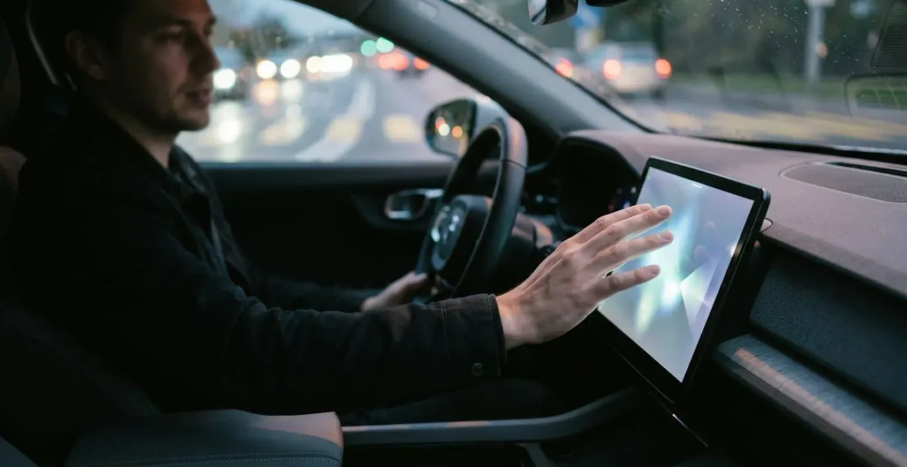
When to Learn Your New Car’s Touchscreen: The 30-Minute Parking Session That Prevents Accidents?
The most dangerous time to learn your car’s infotainment system is while you are driving. Yet, this is what most people do. The only safe way to build the necessary muscle memory and mental maps for a touchscreen interface is while the car is stationary. Dedicating a single, focused 30-minute session in a parked car before you even begin your first proper journey can dramatically reduce your cognitive load and prevent a future accident. Think of it as a pre-flight checklist for your brain.
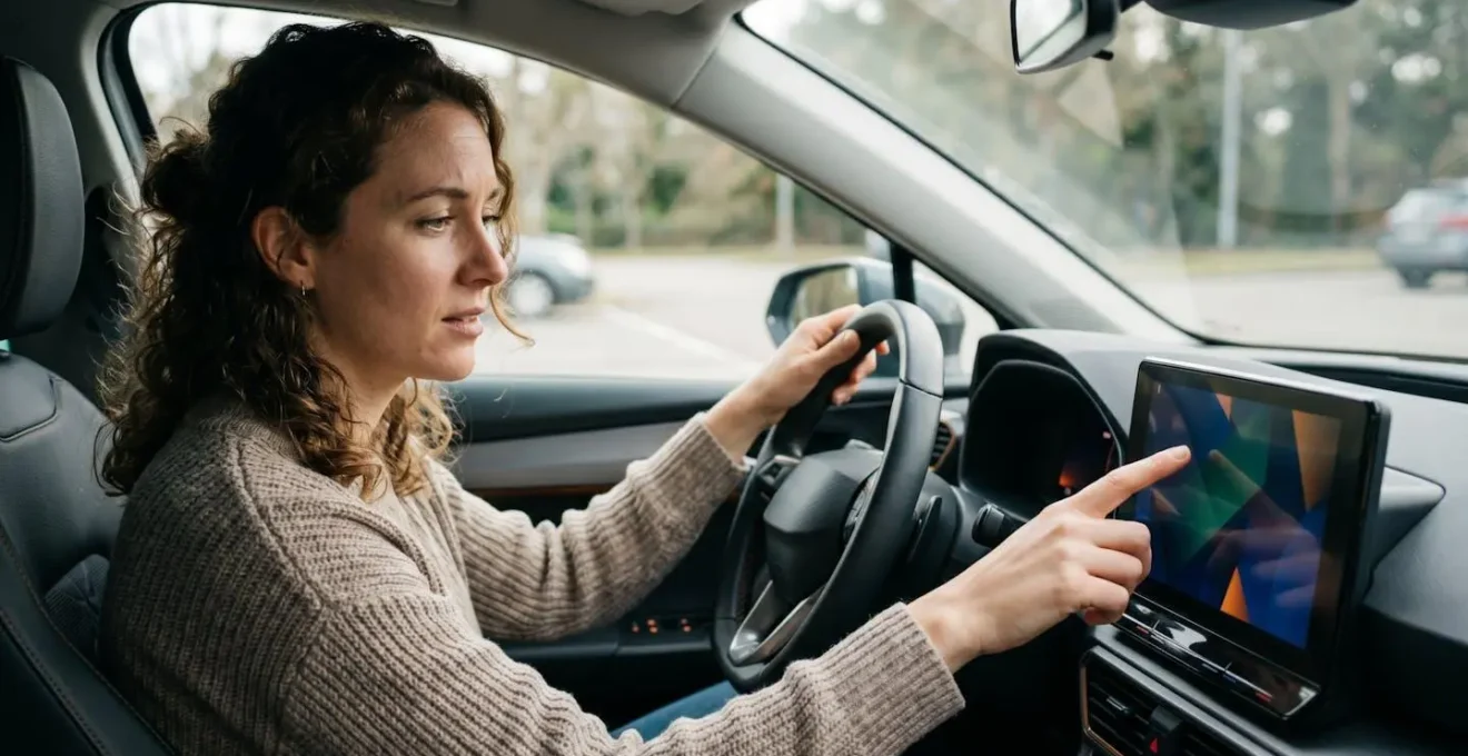
As this image illustrates, the learning environment should be calm and free from the pressures of navigating traffic. During this session, your goal is not to master every setting, but to build fluency with the 5-10 tasks you will perform most often. This includes adjusting the climate, finding your favourite radio station or podcast, and setting a navigation destination. By practising these tasks repeatedly in a safe setting, you begin to build a cognitive map of the interface, reducing the « search time » when you later need to perform that function while driving.
Your 30-Minute Muscle Memory Curriculum
- Minutes 1-10: Master ‘Level 1’ Controls: Practice the most frequent, simple tasks without looking. This includes adjusting the main climate temperature, controlling media volume, and activating the front and rear windscreen defrost. Repeat until you can touch the approximate area of the screen without looking down.
- Minutes 11-20: Practice ‘Level 2’ Tasks: Move on to more complex, multi-step operations. This involves setting a common destination in the sat nav (e.g., « Home »), finding a specific media playlist or radio station, and accessing the trip computer to check your range.
- Minutes 21-30: Practice Voice Commands: Now, attempt every task you just practised by hand, but using only voice commands. Learn the specific phrases the system understands for navigating, making calls, and selecting media. This provides a crucial, safer alternative for when you’re on the move.
This structured practice session is the single most effective safety measure a driver of a new car can take. It’s an investment of 30 minutes that pays dividends in reduced stress and enhanced safety for years to come.
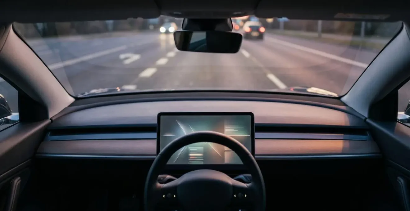
How to Configure Your Digital Cluster to Show Only the Information You Actually Need?
A key advantage of a fully digital instrument cluster is its customisability. However, manufacturers often configure them from the factory to be a dazzling showcase of everything the screen *can* do, rather than what it *should* do. The result is a cluttered display full of redundant or low-priority information that increases your cognitive load. The goal of customisation is simple: information hierarchy. You must decide what information is critical for a specific driving context and hide everything else.
Instead of a one-size-fits-all layout, create context-based views that you can switch between. Most modern cars allow you to save at least two or three distinct cluster layouts. This allows you to tailor the information to the demands of your journey, showing only what’s necessary and hiding what’s not.
Here is a strategic approach to configuring your digital cluster layouts:
- Create a ‘Commute’ View: For daily, familiar routes. This view should prioritise a large map display or simplified turn-by-turn arrows. Speed is secondary but should be clearly legible. Distractions like the current song title or trip data are unnecessary and should be disabled.
- Create a ‘Motorway’ View: For long-distance travel. Here, a large, clear digital speed display is paramount. Equally important are the status indicators for your driver-assist systems (like adaptive cruise control and lane-keeping assist) and a prominent display of your remaining fuel or battery range.
- Create a ‘Backroad’ View: For spirited or rural driving. This view can mimic a traditional analogue layout, with a large tachometer (rev counter) and gear indicator taking centre stage alongside the speedometer. All non-essential information should be hidden to maximise focus on driving dynamics.
- Disable Redundancy: This is the most crucial rule. If your main infotainment screen is already showing the full navigation map, your cluster only needs a simple arrow and distance-to-turn indicator. If the main screen shows what song is playing, turn it off in the cluster. Showing the same information in two places is the definition of distracting clutter.
By taking 15 minutes to configure these layouts, you transform your instrument cluster from a source of visual noise into a powerful, context-aware tool that serves you the right information at the right time, enhancing both safety and driving pleasure.
The Repeated Lane Warning That Signals You Need to Stop for a Coffee Break
Modern Advanced Driver-Assistance Systems (ADAS) are designed to act as a safety net, but they can also serve as a powerful biofeedback tool. A prime example is the Lane Departure Warning (LDW) or Lane Keeping Assist (LKA). When you are alert and focused, you rarely trigger it. However, if you find the system repeatedly vibrating the wheel or beeping at you for drifting out of your lane, don’t just dismiss it as an annoyance. Treat it as a clear, objective signal from your car that your concentration is fading and you are becoming a danger.
Driver fatigue is a major cause of accidents on UK roads, particularly on motorways. Your brain’s ability to make the micro-corrections needed to stay perfectly centred in a lane degrades significantly as you become tired. The ADAS is simply detecting this degradation. A single, unexpected lane drift could be caused by a moment of inattention, but repeated warnings over a short period are a hallmark of fatigue. This is your car telling you it’s time to pull over at the next services for a coffee and a short walk.
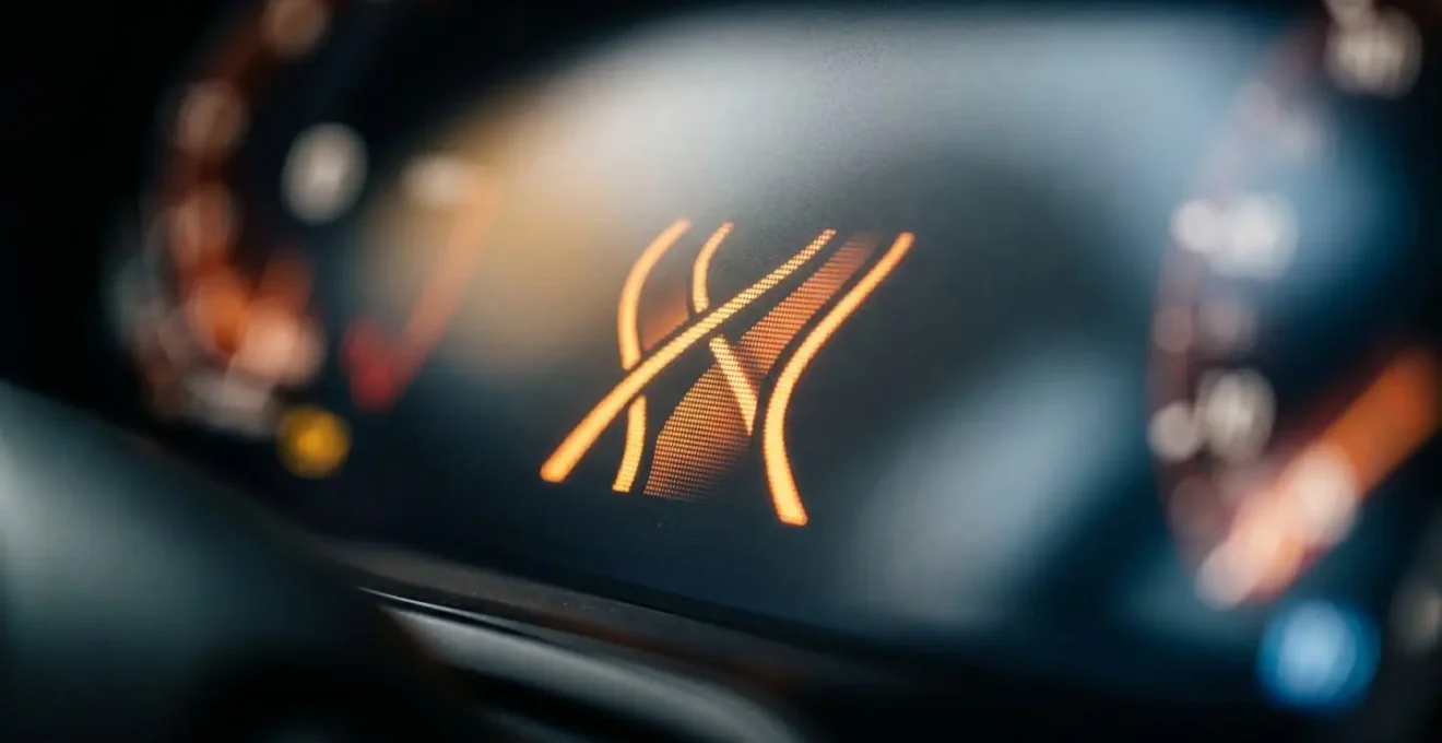
This shift in mindset—from seeing ADAS alerts as a nuisance to viewing them as a vital safety indicator—is crucial. The same applies to Forward Collision Warnings. If the system frequently alerts you to potential front-end collisions, it may indicate you are following too closely or not anticipating traffic flow effectively. Using these systems as a mirror to your own driving habits can make you a safer, more aware driver. The distraction of a touchscreen is dangerous, and research from the Allianz Center for Technology found a 50% increase in accident risk from in-car computer use. Listening to the car’s built-in safety monitors provides a necessary counterbalance.
Key Takeaways
- Touchscreens fundamentally increase ‘cognitive load’ by removing the physical cues (haptic feedback) that allow for no-look operation.
- The safest way to learn a new car’s interface is a dedicated 30-minute stationary session, focusing on core functions and voice commands.
- Customise your digital displays to show less information. Create context-based layouts (e.g., ‘Motorway’, ‘Commute’) to eliminate redundant data and reduce visual noise.
Why Do Digital Dashboards Show More Information but Leave Drivers Feeling Less Informed?
The paradox of the modern digital dashboard is that in the quest to display everything, it often communicates nothing effectively. This phenomenon, where an abundance of data leads to a poverty of attention, is a direct result of ignoring the principle of glanceability. As a human factors expert might explain, some information can be processed almost instantly, while other types require focused mental effort.
The brain can process the position of a needle (e.g., ‘straight up is good’) pre-attentively, in peripheral vision. Reading a digital number requires focused, conscious cognitive effort.
– Human factors research on glanceability, Yes, those big touchscreens in cars are dangerous and buttons are coming back
An analogue speedometer is highly glanceable; a quick look tells you not just your speed, but your speed relative to the limits (e.g., the needle is approaching 70). A digital number requires you to read it, process it, and then mentally compare it to the speed limit. This small cognitive step, repeated hundreds of times on a journey, contributes to mental fatigue. When a dashboard is filled with countless digital readouts, fluctuating numbers, and animated graphics, the driver’s brain is overwhelmed with low-priority data, making it harder to spot the one piece of information that truly matters—like a critical warning light.
This feeling of being less informed despite having more data is validated by drivers themselves. A Quotezone.co.uk survey of 1,000 UK drivers revealed that 47% feel touchscreen dashboards make driving more distracting than cars with traditional physical buttons. The industry is slowly starting to listen, with organisations like Euro NCAP planning to award higher safety ratings to cars that retain physical controls for core functions from 2026.
The solution, for both carmakers and drivers, is a « less is more » philosophy. By consciously simplifying what is displayed, we restore the information hierarchy and allow critical data to stand out. A well-designed digital interface shouldn’t be a demonstration of technological capability, but a quiet, disciplined servant that provides only the necessary information, exactly when it’s needed.
By understanding the cognitive science behind driver distraction, you can move from being a frustrated user to a masterful operator of your vehicle’s technology. The next logical step is to apply these principles and actively configure your car’s systems for maximum safety and minimum stress.