Contrary to the belief that digital dashboards are a clear upgrade, they often create a state of ‘informed ignorance’ by prioritising data quantity over cognitive legibility.
- Physical buttons leverage proprioception (muscle memory), requiring no visual attention, while touchscreens force a competition between looking at the screen and the road.
- Analogue gauges fail gracefully, offering partial information, whereas digital screens face catastrophic, all-or-nothing failure.
Recommendation: Reclaim your focus by consciously configuring your digital display to show the absolute minimum information required for your journey.
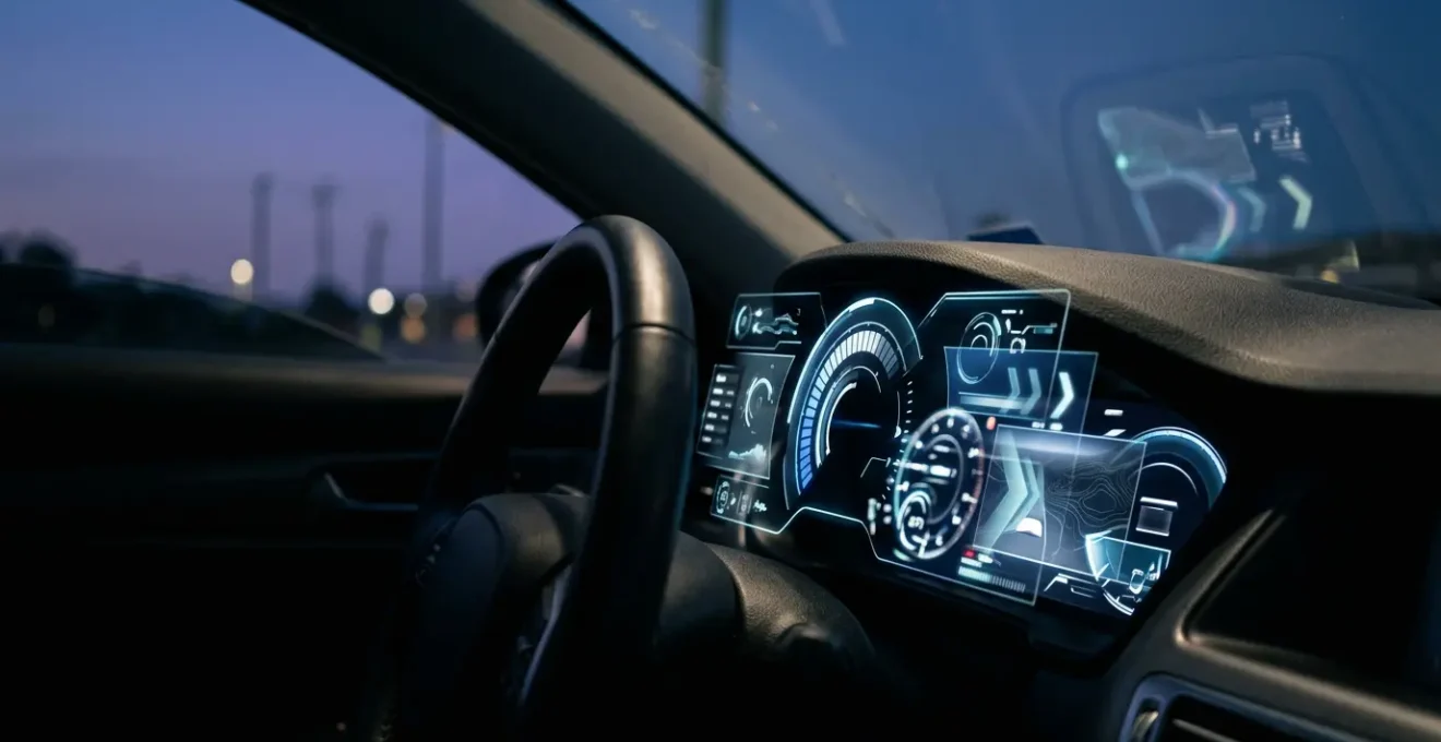
If you’ve recently moved from a car with reassuring, physical needles to one with a vast digital display, you may be experiencing a strange paradox. The screen bombards you with data—efficiency graphs, media art, navigation prompts—yet you feel less connected to the car, less certain of its status at a glance. You’re not alone. This sense of information overload coupled with a lack of true insight is a common ergonomic complaint. The industry has focused on what these screens *can* show, often forgetting to ask what a driver *needs* to see.
The common advice is to « get used to it, » but that ignores the fundamental design flaws. The promise of customisation often hides layers of complex menus, and the sleek, minimalist aesthetic conceals a higher cognitive cost. This isn’t about resisting progress; it’s about questioning whether that progress serves the primary task of driving. The truth is, the switch from analogue to digital isn’t just a technological shift; it’s a neurological one, trading the brain’s efficient, tactile pathways for ones that are slower and demand more conscious effort.
This article will deconstruct the paradox of the modern digital dashboard. We will explore the ergonomic and cognitive reasons why these systems can feel so counter-intuitive. We will move from practical configuration tips to the science behind eye strain and driver distraction, ultimately revealing why your old car’s simple buttons felt so much more effective. It’s time to understand the ‘why’ behind the frustration and learn how to regain control of your cognitive space behind the wheel.
To help you navigate this complex topic, we’ve broken down the key issues you might be facing. This guide will walk you through the core principles of display ergonomics, helping you understand and mitigate the challenges of your new digital cockpit.
Summary: The Digital Cockpit Deconstructed
- How to Configure Your Digital Cluster to Show Only the Information You Actually Need?
- Why Do Digital Dashboards Fail Completely While Analogue Gauges Degrade Gracefully?
- Bright Mode or Dark Theme: Which Digital Dashboard Setting Reduces Eye Strain at Night?
- The Screen Flicker That Signals Your Digital Cluster Needs Urgent Software Attention
- How to Position Your Digital Display for Comfortable Reading Without Neck Strain?
- Why Do Touchscreen Climate Adjustments Take 3x Longer Than Physical Dials?
- The Repeated Lane Warning That Signals You Need to Stop for a Coffee Break
- Why Does Your Car’s Touchscreen Distract You More Than Your Old Button Controls Did?
How to Configure Your Digital Cluster to Show Only the Information You Actually Need?
The primary promise of a digital dashboard is customisation, yet manufacturers often bury essential settings under layers of menus. The goal isn’t to display everything possible, but to achieve cognitive legibility—the ability to understand critical information with a mere glance. The first step is to perform a ruthless cull. If your cluster has multiple « views » (e.g., Sport, Eco, Comfort), choose the one with the fewest visual embellishments and stick with it. Consistency is key to building quick recognition patterns.
Next, enter the display settings and disable any information that isn’t mission-critical for 95% of your driving. Do you really need to see the album art, a real-time power distribution diagram, or a G-force meter on your daily commute? Probably not. Prioritise a large, clear speedometer and essential ADAS (Advanced Driver-Assistance Systems) notifications. Everything else is a potential distraction. This process of simplification is crucial because navigating complex on-screen menus while driving is inherently dangerous. In fact, research from the National Institutes of Health demonstrates that any task taking longer than 2.0 seconds can significantly increase cognitive demand and risk.
The principle here is to create an « information-quiet » space. Your display should be a calm, predictable source of truth, not a billboard competing for your attention. By consciously removing the clutter, you reduce the mental processing required to find the data that actually matters, like your speed or next turn.
Case Study: The Cognitive Benefit of a Single Screen
A 2024 study comparing single-screen interfaces (like a Tesla Model 3) to multi-screen setups (like a Hyundai Ioniq 6) provided clear evidence for simplification. The study found that the single-screen design significantly reduced the driver’s perceived cognitive load, effort, and frustration, while boosting overall user satisfaction. This was especially true for drivers over 50, suggesting that as information density increases, the cognitive cost to process it rises disproportionately for those less accustomed to complex digital interfaces.
Your Action Plan: Taming the Digital Cockpit
- Display Audit: For one week, make a mental note of the information you actually use versus what’s just on the screen.
- Menu Dive: Set aside 15 minutes while parked to explore every menu and submenu in your car’s « Display » or « Vehicle » settings.
- The ‘Minimalist’ Pass: Create a primary view that shows only three things: digital speed, fuel/charge level, and the next navigation instruction if active.
- ADAS Pruning: Review your driver-assist settings. Keep essential warnings (like collision alert) but consider disabling less critical ones if they prove distracting.
- Test & Refine: Drive with your minimalist setup for a few days. Only add back an information element if you find yourself genuinely missing it.
Why Do Digital Dashboards Fail Completely While Analogue Gauges Degrade Gracefully?
A traditional analogue speedometer is a beautifully simple piece of engineering. If its cable frays or a gear wears, it might start to wobble, read inaccurately, or stick—but it rarely just dies. This is the principle of graceful degradation. The system provides clues about its impending failure and often continues to provide partial, albeit imperfect, information. A flickering needle still tells you more than a blank screen.
This paragraph introduces a complex concept. To well understand it, it is useful to visualize its main components. The illustration below breaks down this process.

A digital dashboard, by contrast, operates on a principle of catastrophic failure. It is a single, complex system reliant on software, processors, and a fragile screen. When a critical component fails—be it a software bug, a faulty power supply, or a loose connector—the entire system can go dark in an instant. There is no wobble, no warning; just a sudden and complete loss of information. One moment you have a vibrant display showing your speed, navigation, and warnings; the next, you have a black rectangle and no legal way of knowing how fast you are travelling.
This fundamental difference in failure modes is a critical ergonomic consideration. While digital failures are rarer, their consequences are more severe. The simplicity of mechanical systems is their strength. As noted in an automotive engineering analysis, the inherent design of physical gauges provides a distinct advantage in resilience.
Digital gauges, while providing precise readings and advanced features, often require more frequent maintenance because of their electronic circuitry and sensitivity to moisture and dust.
– Caratoz Automotive Dashboard Analysis, Analog vs. Digital Gauges in Car Dashboards comparison study
The issue isn’t that digital technology is unreliable, but that it lacks the inherent robustness and predictable failure patterns of its mechanical predecessors. For a safety-critical system like an instrument cluster, this is a significant step backwards in user-centric design.
Bright Mode or Dark Theme: Which Digital Dashboard Setting Reduces Eye Strain at Night?
As dusk falls, your digital dashboard presents a new ergonomic challenge: glare. Most modern systems automatically switch from a bright « day mode » to a « dark mode, » but the effectiveness of this change depends entirely on the colours used. The goal at night is to preserve your scotopic vision—your eyes’ ability to see in low light, which is crucial for spotting hazards on the road ahead. Bright, cool-toned screens actively work against this.
The science is clear: the photoreceptor cells in your eyes used for night vision, known as rods, are highly sensitive to blue light. Exposing them to the blue-white light common in many « sport » display modes effectively bleaches the light-sensitive pigment (rhodopsin), impairing your dark adaptation. Conversely, research on human vision physiology shows that the rhodopsin in human rods is much less sensitive to longer, red wavelengths. This is why military and aviation cockpits have historically used red or amber lighting for night operations.
For your car’s dashboard, this means a dark theme with amber or red accents is almost always superior to one with blue or bright white highlights. While a crisp white font on a black background might look sharp, the high contrast can create a « halo » effect and cause eye fatigue. A softer, warmer colour reduces the strain and minimises the impact on your ability to see into the darkness outside the windscreen. As one expert on an astronomy forum astutely noted when discussing how to preserve night vision for stargazing:
Amber is preferred because it blocks blue light which ruins your dark adaptation, while still allowing a wider range of wavelengths for seeing at night and having some useful color vision.
– KLWalsh, Cloudy Nights Astronomy Forum
Therefore, when configuring your display for night driving, actively choose the theme that minimises blue light. Your eyes will thank you, and your ability to perceive the road ahead will be measurably improved. It’s a simple switch that makes a significant difference to both comfort and safety.
The Screen Flicker That Signals Your Digital Cluster Needs Urgent Software Attention
A flickering screen in your instrument cluster is more than just an annoyance; it’s a critical symptom that demands immediate attention. Unlike the benign hum of an old engine, a digital flicker can signal anything from a minor software glitch to an impending hardware failure that could leave you without a speedometer. The key to diagnosis is observing the nature of the flicker itself.
Is the flicker consistent and repeatable? For example, does it happen every time you use the turn signal or activate a specific menu? This often points to a software bug. The display’s controller is struggling to render a new state, causing a momentary refresh error. In many cases, this can be resolved with an over-the-air (OTA) software update from the manufacturer or a reset by a dealership technician. It’s a flaw in the code, not the physical components.
Conversely, is the flicker random, intermittent, or triggered by physical events like going over a bump or closing a door? This is a strong indicator of a hardware fault. The problem could be a loose connector behind the dashboard, a failing power supply, or corrosion on a circuit board. These issues are far more serious as they tend to worsen over time, eventually leading to a complete failure of the display.
Diagnostic Approach: Software vs. Hardware Faults
Repair specialists like UpFix have a clear diagnostic tree for these issues. They identify software bugs by their consistent, repeatable nature. Hardware faults, on the other hand, are often linked to physical variables. For instance, high resistance in a ground line can cause flickering or inaccurate gauge readings, while issues like worn connectors or shorted fuses often lead to sporadic function or a total blackout. A driver reporting that their cluster flickers randomly when it’s cold is likely describing a physical connection contracting, not a software issue.
Never ignore a flickering dashboard. Document when and how it happens and report it to your service centre. Distinguishing between a software bug and a hardware fault is the first step a technician will take, and providing them with precise details can save significant diagnostic time and prevent a more serious failure down the road.
How to Position Your Digital Display for Comfortable Reading Without Neck Strain?
While you can’t physically move your car’s built-in digital cluster, understanding its optimal ergonomic placement is crucial. Your ability to read the display comfortably and without strain is determined by the « driver’s triangle »—the geometric relationship between your eyes, the steering wheel, and the instrument panel. Manufacturers spend millions on getting this right, but a poor driving position can ruin it all.
The first step is to perfect your seating position. Adjust your seat so your line of sight is clear over the top of the steering wheel, not through it. The top of the instrument cluster should be fully visible without you having to duck your head or crane your neck. This minimises the glance angle—the degree to which your eyes must deviate from the road to read the instruments. A smaller glance angle means less time with your eyes off the road and less strain on your neck muscles.
This paragraph introduces a complex concept. To well understand it, it is useful to visualize its main components. The illustration below breaks down this process.
The impact of dashboard layout on driver wellness is not trivial. It has a measurable physiological effect. For instance, a 2022 Frontiers in Public Health study found that different dashboard layouts led to significant differences in the time drivers took to search for and read information, and even affected their heart rate. A poorly positioned or cluttered display literally increases your stress.
Head-Up Displays (HUDs) are one technological solution to this problem, as they project information directly into the driver’s line of sight, reducing the glance angle to near zero. If your car is equipped with a HUD, configure it to show the most critical information (speed and navigation) and relegate the main cluster to a secondary role. This creates the most ergonomically sound and least distracting setup possible, allowing you to keep your focus where it matters most: the road ahead.
Why Do Touchscreen Climate Adjustments Take 3x Longer Than Physical Dials?
If you’ve ever found yourself fumbling to change the cabin temperature on a touchscreen while driving, you’ve experienced a classic failure of digital interface design. The reason a simple physical dial feels so much faster and safer is explained by a core principle of human-computer interaction: Fitts’s Law. This law states that the time it takes to move to a target is a function of the distance to the target and its size.
A physical climate dial is a large, fixed, and tactile target. You don’t need to look at it to operate it. Your hand knows where it is, and your fingers can find it, grip it, and turn it by feel. This is called proprioception, or muscle memory. It’s a non-visual task. A touchscreen button, however, is a small, flat, non-tactile target that exists in a different location on the screen depending on the active menu. To use it, you must:
- Look away from the road to locate the « Climate » menu icon.
- Tap it accurately.
- Visually locate the small ‘+’ or ‘-‘ icon for temperature.
- Tap that icon repeatedly, visually confirming the change each time.
Each of these steps requires visual attention, directly competing with the primary task of driving. According to Fitts’s Law principles in human-computer interaction, the combination of a small target size and the need for high-precision pointing (with a moving hand in a moving vehicle) dramatically increases the time and cognitive load required for the task.
Designers who replace physical controls with touchscreen equivalents are trading away decades of established ergonomic wisdom for a sleek, but functionally inferior, aesthetic. They are ignoring the fundamental neurological difference between a tactile action and a visual-motor one. The frustration you feel isn’t just your imagination; it’s a predictable outcome of poor human-factors design.
The Repeated Lane Warning That Signals You Need to Stop for a Coffee Break
Your car’s Lane Keeping Assist system is designed to be a safety net, nudging you back into line if you unintentionally drift. However, if you find it activating frequently on a long journey, it may be signalling something more profound than a momentary lapse in concentration. A series of repeated lane departure warnings is often a clear symptom of driver fatigue and attentional saturation.
As you get tired, your ability to make the constant, tiny steering corrections needed to stay perfectly centred in your lane diminishes. Your inputs become less frequent and more reactive. The car drifts, the system intervenes, and you correct. If this cycle repeats, the car is essentially telling you that your own internal guidance system is running low on processing power. This is especially true on motorways, where the monotonous environment can lull the brain into a state of reduced alertness.
This is where the ‘informed ignorance’ of digital systems becomes apparent. The system correctly identifies a symptom—drifting out of a lane—but the driver often misinterprets the cause. You might blame the road’s camber or a gust of wind, or simply become annoyed at the « nagging » system. The real message, however, is that your cognitive resources are depleted. The dashboard, which may be simultaneously showing you complex navigation or media information, is contributing to this cognitive overload, leaving you with less mental bandwidth for the primary task of steering.
So, the next time your lane assist chimes for the third time in ten minutes, don’t just get annoyed. Heed the warning. It’s one of the most reliable, objective indicators your vehicle can provide that it’s time to pull over, stretch your legs, and have that coffee. The system isn’t being overly sensitive; it’s providing you with data about your own degraded performance.
Key takeaways
- Digital systems create ‘catastrophic failure’ (all-or-nothing), while analogue gauges offer ‘graceful degradation’ (partial information).
- For night driving, a dark theme with amber or red accents is ergonomically superior as it preserves your night vision by minimising blue light.
- The superiority of physical buttons is due to proprioception (muscle memory), which requires no visual attention, unlike touchscreens that demand it.
Why Does Your Car’s Touchscreen Distract You More Than Your Old Button Controls Did?
The core reason your car’s new touchscreen feels more distracting than the array of buttons in your old car lies in a fundamental difference in how your brain processes information. It’s a direct conflict between two distinct neurological pathways: the proprioceptive pathway and the visual pathway.
Operating a physical button—a volume knob, a fan speed dial, a window switch—is an act of proprioception. This is your body’s innate sense of its own position and movement. Through repetition, you develop muscle memory. Your hand knows exactly where to go to turn up the radio without your eyes ever needing to leave the road. The tactile click or resistance of the control provides all the confirmation you need. It’s an efficient, low-load background task for your brain.
A touchscreen obliterates this pathway. There is no muscle memory for a button that could be anywhere on a flat plane of glass. To operate a touchscreen, you are forced to engage your visual pathway. You must look at the screen, locate the target, guide your finger to it, and visually confirm the action. As a critical human factors analysis explains, this creates a direct competition for resources.
The neurological difference: operating a physical button uses proprioception (the sense of self-movement and body position), which doesn’t require visual attention. A touchscreen forces the brain to use the visual pathway, directly competing with the primary task of looking at the road.
– Human Factors Research Analysis, Touchscreen vs physical controls neurological pathway study
This isn’t just about a few extra seconds of glance time. It represents a fundamental increase in cognitive load. While your visual system is busy hunting for an icon on the screen, it’s not fully engaged in scanning for road hazards. This is why even a simple task on a touchscreen feels more demanding and distracting. Automakers, in their quest for a clean, futuristic aesthetic, have traded a highly efficient, tactile interface for one that is visually demanding and cognitively expensive.